Infographics and articles that update themselves, built on free APIs
Once an article goes live, it starts to go stale, so I built The Daily Visual, a prototype site that rebuilds its charts, its data and the numbers in its sentences every morning from free public APIs. In today's post we're taking a closer look at how far that goes, what broke in its first month, and where I'd take it next.
 Richard Baxter AI Ops & Marketing Engineer
 On this page
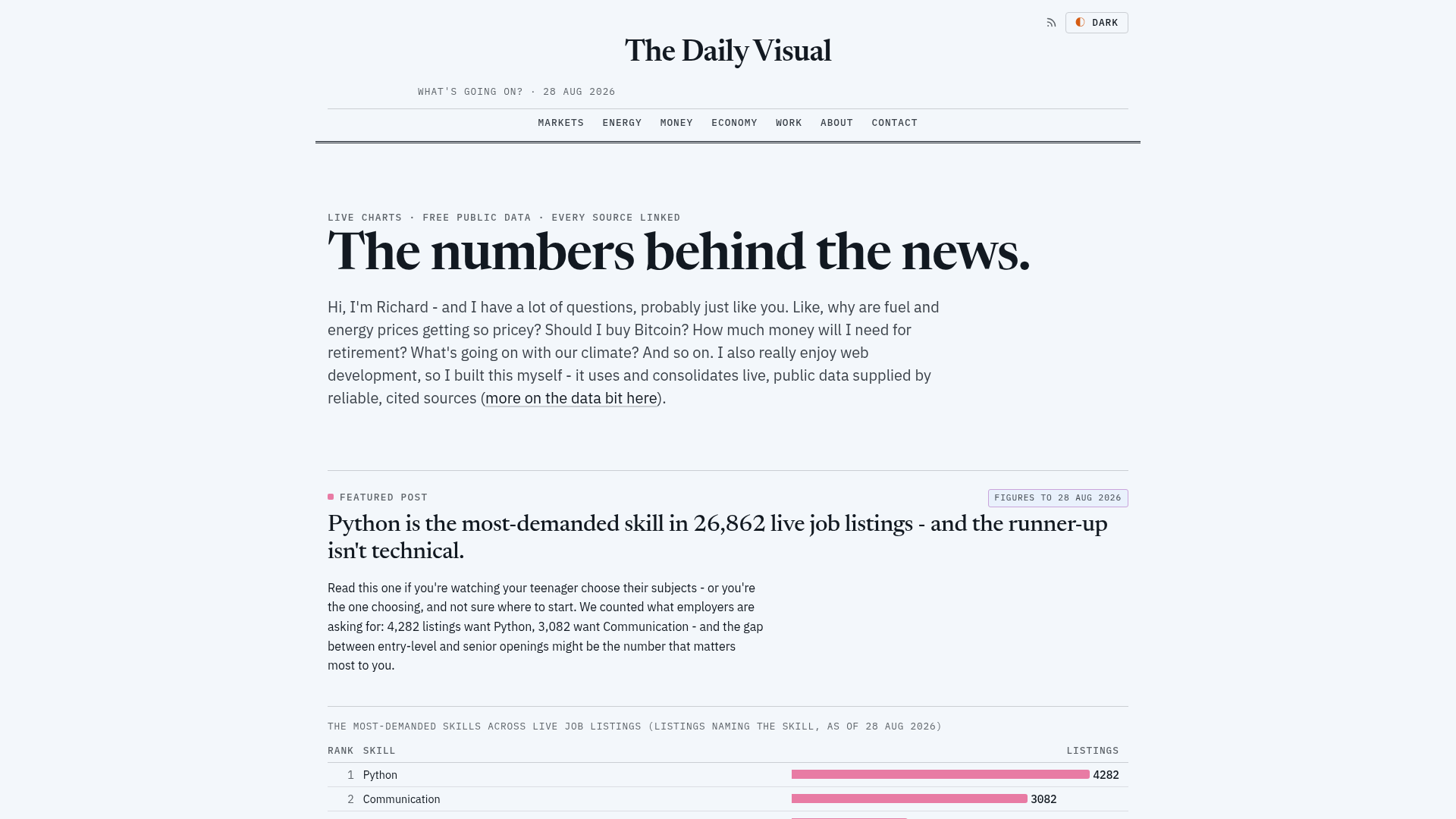
With The Daily Visual, what I wanted to experiment with is the idea of a more dynamic type of article. The problem that a lot of publishers have is that once a blog post or a news article goes live, it begins to go stale. So, using my experience with automated article updating and a collection of free API sources, I wanted to build a prototype website that could show me how far this type of thing is possible.
The answer is, of course, a Cloudflare Workers-based Astro website with various free API endpoints hooked up, which updates on a daily schedule. It's interesting because it's updating the charts and the data itself, but it's also making micro edits in the copy, to change, for example, a GDP number or an inflation number, or whatever metric the article's about. Every morning a Claude Code scheduled task rebuilds it from free public data, then reads the changed pages back to check the numbers still make sense.
Quick Navigation
What I built |
How the numbers update |
The morning routine |
Where the prototype stops |
Making the page the infographic |
What we've got
What I built
I built the site with Astro (a framework that turns templates and data into plain HTML pages), and it's served by a single Cloudflare Worker, which is a small program that runs on Cloudflare's network and here mostly just hands out those finished pages. All of the data is fetched when the site builds, which is when Astro pulls every source and writes every page out, so nothing is calculated when a reader arrives and there's no database behind it. The charts are drawn at the same time, as SVG images using d3, a JavaScript charting library.
A free API is a public address that a program can ask for data without paying for it. The data here comes from 11 feeds, run by 9 publishers: EIA (the US Energy Information Administration), FRED (the St. Louis Fed's economic data service), the US Census Bureau, the US Treasury, Freddie Mac, the World Bank, the ONS (the UK's Office for National Statistics), YubHub (my own job-listings index) and the Anthropic Economic Index. Only EIA, FRED and Census ask for a key, and all three keys are free. Between them they supply the 56 series in the site's public data catalogue, and the code calls on 33 different FRED series.
As of 23 September there are 23 stories across 5 topics, built in 150 commits between 26 August and 21 September 2026, and 138 of those landed in the first four days. Since the start of September, nearly every commit has been the morning routine fixing something it found.
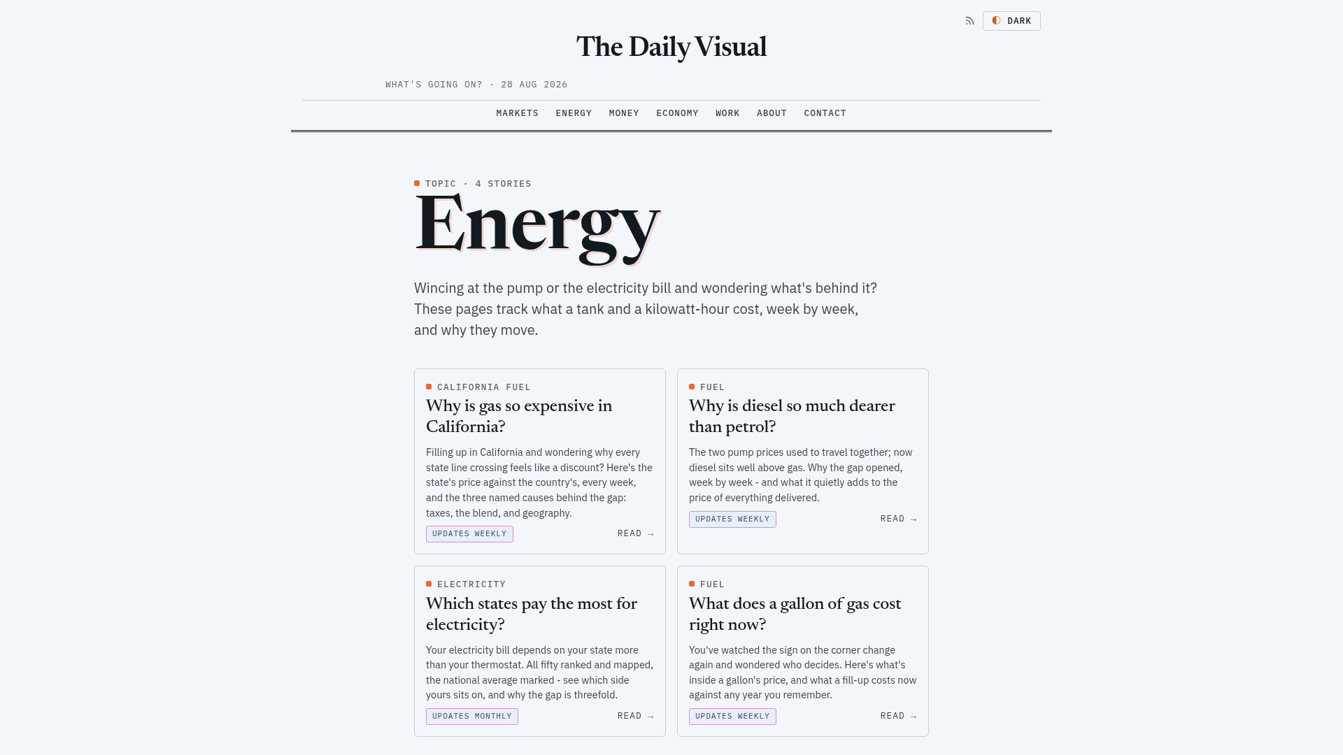
The Energy topic hub. Each story card carries its own update cadence, set by how often its source publishes.
How the numbers in the sentences update
None of the numbers in The Daily Visual's sentences are typed in. Each one is a code expression in the page template, recalculated from the fetched data on every build, and that goes for the numbers in the titles and headings too. On 23 September the fuel-prices page's heading moved from 36% to "Why is Fuel 41% dearer than a year ago?"
The rule is that a sentence depending on the data carries a version for every state the data can be in, whether that's up, down, unchanged or a new record, and the recession page, for example, opens with "Not on the numbers." and only switches to a different opening if the data says the US is in recession. There's no AI involved in any of it, just templates and arithmetic run when the site builds.
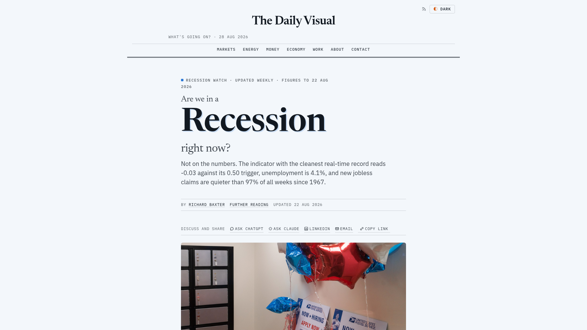
The recession page, with the indicator readings its opening answer is computed from.
The first thing I got wrong was a missing state. In August, US unemployment was 4.1%, the same as July, but the test behind the sentence only had two branches, so an equal reading went down the falling branch and the page said unemployment was "down from 4.1% the month before" and "easing". The fix was a third state, so the sentence now says "unchanged from" and "flat" when the two figures match.
The inflation bug was harder for me to spot. FRED's consumer price index series is missing October 2025, and the calculation stepped back twelve rows rather than twelve months, which meant every reading across the gap compared thirteen months. The headline said 3.7%, when comparing August with the August before gave 3.4%. It now looks up the same month a year earlier by its date, and drops any month with no year-earlier reading.
The morning routine
The morning routine runs in Claude Code, Anthropic's coding agent, which I set up with a scheduled task, a job it runs on its own at a set time. I called it tdv-daily-maintain and set it for 07:30 UK time, which in practice means most runs start between 07:34 and 07:52. It has run most mornings since 28 August, with 26 runs in the log as of 23 September.
Each run rebuilds and deploys the site, then checks that every page's data is as fresh as its source allows. It compares each page's headline states against the day before (a new record, a spread changing sign, rising turning to falling), so any page where one has flipped gets read in full and screenshotted, and the run finishes by writing a dated log entry and committing the changes to the repo.
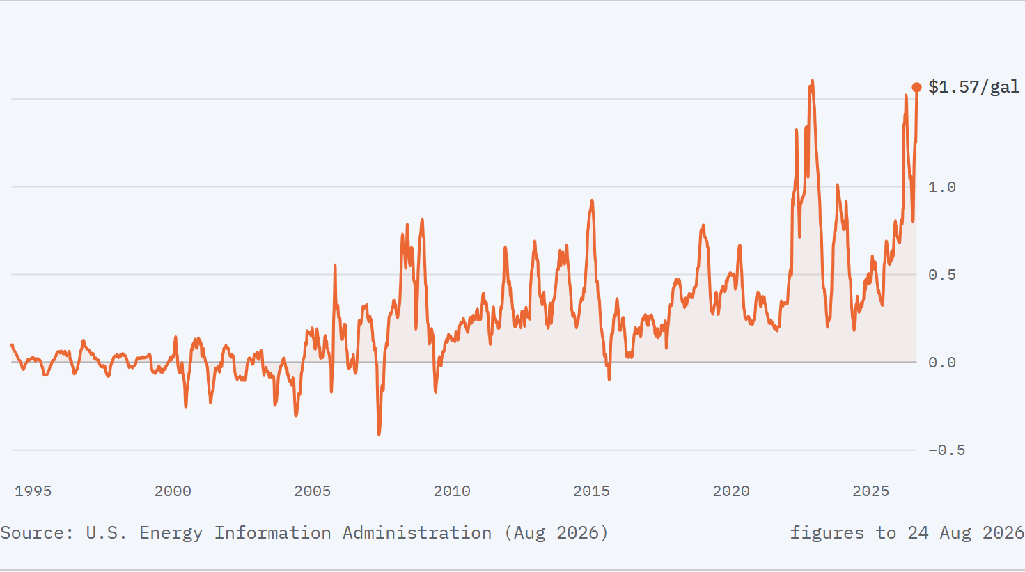
Diesel's premium over regular petrol since the mid-1990s, from the EIA's weekly series, with figures to 24 August. The chart redraws on every build.
It fixes mechanical errors itself, and anything that needs a sentence rewritten it flags to me. The commodities page, for example, said tin was "at the very top", and then the August World Bank release put European natural gas top of the price-change ranking and tin third, so the sentence went false. The routine rewrote it to give tin's own percentage change, which the page already calculated, instead of its position. The same run flagged the new leader being lowercased as "natural gas (europe)" and left it alone, because the casing was my call.
Most of the bugs it has fixed were ones I'd shipped, live on a page before it caught them, and the worst came on 21 September, when YubHub returned a skills row labelled "AI" instead of "Artificial Intelligence", and a silent fallback in my code turned the missing row into a zero. The page divided by that zero and printed "1 in Infinity live listings". The build now fails and names the labels it did find, so a missing row stops the deploy.
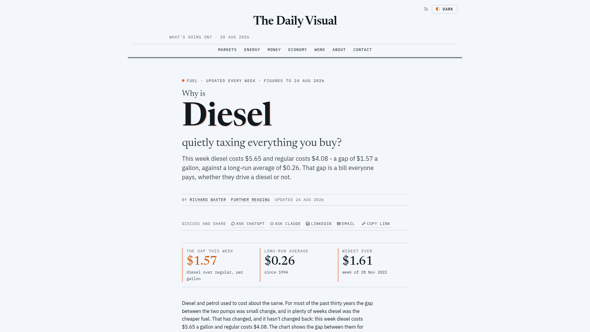
The stat panels on the diesel page in late August: that week's gap, the long-run average and the record, each computed when the site built.
Where the prototype stops
It is a prototype, and it's something that I think merits further development. The numbers wired to data stay current, but any number typed into the prose by hand goes stale exactly as it would on any other site. As of 23 September the routine has flagged several of them for me. The mortgage page says rates moved "a tenth of a point" beside a card showing 0.69 percentage points, the grocery page says "Coffee tops the table" when ground beef tops it, and the UK-since-Brexit page says real pay "peaked at £516" next to a figure of £531.
The routine isn't allowed to rewrite those, so they sit in the log until I get to them. That's deliberate, which means the routine can correct a figure or a mechanical slip in a sentence, but any sentence whose argument has changed waits for me.
Making the page the infographic
The next stage of development, I think, would be to make the pages much more visual, drawing on experience from websites like Visual Capitalist (the publisher known for its data infographics). How can we make that type of output, infographic style, far more dynamic and continuously updated? I think that would just make a generally better article.
Visual Capitalist publishes its infographics as static images, which is the gap The Daily Visual's spec was written around. It calls the site "the idea Visual Capitalist forgot to build", and its goal is that "the page IS the infographic", a visual that re-renders when the data updates, with the prose around it. None of that is built yet. The spec was approved on 27 August, and the pages are still articles with charts in them.
This goes to the dashboards work that I did on Mandala, and the Bitcoin tracker that started there on GitHub Pages. Mandala is an open-source set of five data-story dashboards, built from public data that costs nothing to use, such as FRED, the World Bank and Our World in Data. GitHub Actions, the automation built into GitHub, refreshes them every six hours. They include the Breakfast Index, which tracks coffee, sugar, wheat and orange juice prices against 2015, and When Does the Music Stop?, a set of bubble warning lights. I ported the yield-curve and Bitcoin pages on The Daily Visual from Mandala, and the Bitcoin dashboard itself moved to myminingrig.com/bitcoin/ on 19 July 2026.
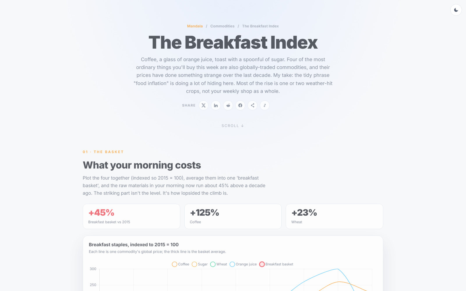
The Breakfast Index on Mandala, one of the five dashboards refreshed every six hours.
Mandala writes its summaries with an AI model, OpenAI's GPT-4.1 mini through GitHub Models, on every refresh, and the model is told to use only the numbers it's given, whereas The Daily Visual's sentences are written by a person, and only the figures and the choice of version change on each build.
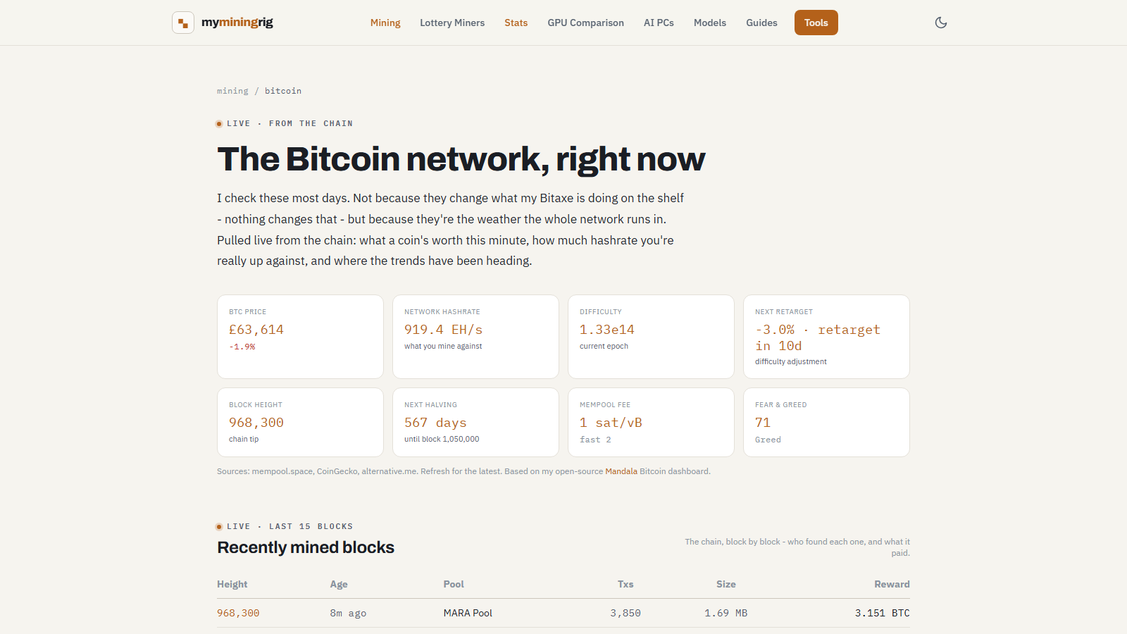
The Bitcoin dashboard, ported from Mandala to myminingrig.com/bitcoin/ in July.
What we've got, and what's next
We've got 23 stories that a scheduled task rebuilds every morning, with every number wired to data recalculated on each build. So, how far does it go? A number wired to data stays current, and a sentence can switch versions as the data moves, but anything typed by hand still needs a person, and the routine has logged six fixes in its first 26 runs, most of them for bugs that were live on the page before it caught them. What's left is the typed numbers still sitting in the prose, and pages that work as the infographic.
The principle behind anything I build like this is always the same. What is the limit of the technology we've got to hand, where normally we'd have to go out to a software as a service company and pay big subscription fees for the very same? Here, the data and the keys cost nothing, and the site is live at thedailyvisual.com. Mandala's code is on GitHub for anyone who wants to build their own.
Continue reading.
- AI WorkflowsAI Fact Checking: How I Check My Content Reliably With Agents
- AI WorkflowsHow to Write a PRD an AI Can Build From (with a template)
- AI at WorkAI isn't taking the jobs, it's taking the boring bits
- How-to GuidesHow to Connect Claude to Shopify with MCP (Dev MCP and Storefront Catalog)
- Beginner's GuidesWhat is n8n? A Beginner's Guide to Workflows, Pricing and Self-Hosting
- How-to GuidesHow to Use AI for Market Research with Claude