How to Improve Your AI Prototype Designs with Skills, Prompts and Gemini
I build a lot of single-file HTML prototypes with Claude Code. They work, but they all end up looking the same. I tested three approaches to fix this - Claude Skills, manual prompt engineering, and Gemini MCP feedback.
I build a lot of single-file HTML prototypes with Claude Code. They work, but they all end up looking the same: dark background, system fonts, cyan accents, centred layout. It's not bad, exactly. It's just so generic and cheap looking. I spent a week testing three different approaches to solve this - Claude Skills, manual prompt engineering, and Gemini MCP feedback. Here's how that went.
What You'll Need
- Claude Code (either Terminal or GUI)
- A working HTML prototype you want to improve (I'll use a colour palette generator)
- Our (my) Gemini MCP server configured in your Claude settings
I don't have any formal design training, and that's sort of why I wrote this.
AI Prototypes All Look the Same
Ask Claude to build you a web tool and you'll get something functional. Clean layout, safe colours, responsive out of the box. But underneath that competence sits the same visual DNA: system fonts, dark gradient background, uniform rounded corners, default Nodejs icons, some shade of blue or purple for the accent.
Anthropic's own team calls this "distributional convergence." The model predicts the most probable next token, and for frontend code the most probable tokens produce the same handful of design choices. Inter font, white cards on grey backgrounds, purple-to-blue gradients. You know those blog posts that open with "In today's fast-moving world"? Same problem, different medium.
The fix isn't a better model. It's better instructions. I found three ways to deliver those instructions, and each one pushed the output in a different direction.
The Starting Point
I wrote a colour palette generator for a previous article and it became my guinea pig here. One HTML file with CSS and JavaScript inline, roughly 370 lines. It picks a random base hue, generates five harmonious colours, and lets you click to copy hex codes.
It's perfectly functional. It also looks exactly like the last five things Claude built for me. Dark gradient from #0f0f1e to #1a1a2e, system font stack, cyan #00d4ff as the accent. The cards are uniform, the layout is centred, the whole thing screams "Claude wrote this."
Let's fix it three different ways.
Approach 1: Install a Claude Skill
Skills are markdown files that sit in your project's .claude/skills/ directory. When you mention them in a prompt, Claude loads the file into context and follows the instructions inside. Anthropic publishes a few official ones, including frontend-design which is specifically designed to break the convergence problem.
Installation is just a file copy. Grab the raw markdown from Anthropic's skills repository and save it as .claude/skills/frontend-design.md in your project root.
The Skill covers five design dimensions:
- Typography: Never use Inter, Roboto, Arial, or system fonts. Pick distinctive Google Fonts instead.
- Colour: Choose a dominant colour with sharp accents, define CSS variables, commit to a cohesive aesthetic.
- Motion: CSS animations, staggered reveals via
animation-delay, scroll-triggered effects. - Spatial composition: Asymmetry, overlap, diagonal flow, grid-breaking. Generous negative space.
- Backgrounds: Gradient meshes, noise textures, geometric patterns, grain overlays.
The important bit buried in the Skill is this: "Choose a clear conceptual direction and execute it with precision. Bold maximalism and refined minimalism both work - the key is intentionality, not intensity."
Here's the outcome when I asked Claude to redesign my palette generator with the Skill loaded:
Redesign colour-palette.html using the frontend-design skill.
Make it feel like a print magazine layout.Night and day. Playfair Display for headers, Space Mono for code. Warm cream (#f5f0e8) replacing that default dark gradient. The grid went asymmetric - first swatch takes double width. A noise texture sits over the background, cards stagger in on load, and heavy 3px borders push it toward a brutalist editorial feel.
Typography and spatial composition jumped up several notches. The layout actually has personality now - the Skill shoved Claude away from its defaults across every dimension. That grain texture over the cream background? Turns out flat colours feel sterile without it.
I opened the finished page and half the choices were fighting each other. The 4.5rem heading? Technically distinctive. Also comically large for a utility tool. In my case the brutalist borders clashed with the warm background. I ended up hand-tweaking both after the fact.
Approach 2: Write a Manual Aesthetics Prompt
Anthropic published a cookbook entry called Prompting for Frontend Aesthetics that contains something useful: a ~400 token system prompt that targets the four dimensions where Claude's defaults are weakest.
Skip the Skill file, paste your design constraints straight into the prompt. Here's a trimmed version of what I sent:
Redesign this colour palette generator with the following design constraints:

TYPOGRAPHY: Use Bricolage Grotesque (headers) and IBM Plex Mono (code/data).
No system fonts, no Inter.

COLOUR/THEME: Warm dark palette. Background #1c1917, cards #292524,
accent amber #f59e0b. Subtle radial gradient ambient glow.

MOTION: Stagger card entrance with cubic-bezier easing.
Scale + fade, not just translate. Keep it under 400ms total.

BACKGROUNDS: Subtle radial gradients for ambient light.
No noise texture this time - keep it clean.This version keeps the dark theme but transforms it. Bricolage Grotesque is a distinctive sans-serif that you won't find in any AI default - it has optical sizing built in and a slightly quirky character. IBM Plex Mono for the data gives it a technical feel without falling back to Courier. The amber accent is warmer than cyan. Card animations use a proper cubic-bezier curve with staggered delays.
I also added a keyboard shortcut hint ("Press Space for new") and wired it up, which is a nice UX touch the original lacked.
I got exactly the fonts, colours, and animation curve I specified. No interpretation, no unexpected choices. When you know what you want, a direct prompt is faster than a Skill.
Note: You need to already have opinions about fonts and colour to write a good constraint prompt. I only knew Bricolage Grotesque existed because I'd been browsing Google Fonts the week before. No font name ready? That's the Skill's job.
Approach 3: Use Gemini MCP for Design Critique
I saved this one for last because I genuinely didn't know if it would work. The Gemini MCP server hooks Claude into Google's Gemini for image analysis and generation, but the part I cared about was design critique. Feed it a screenshot, get back opinions.
If you've got the Gemini MCP configured, Claude can call gemini_prompt_assistant which has built-in templates for visual design. But the more useful pattern is sending Gemini a screenshot of your prototype and asking for specific feedback.
Here's the workflow I used:
- Screenshot the original prototype
- Send it to Gemini with
describe_imageand a design critique prompt - Feed Gemini's suggestions back to Claude as redesign instructions
The prompt I sent to Gemini:
Analyse this web tool screenshot as a UI designer. Identify:
1. Three specific things that make it look like generic AI output
2. Concrete improvements for typography, colour, spacing and layout
3. A suggested design direction that would make it feel more intentional

Be specific - font names, hex codes, pixel values. Not vague advice.
Gemini came back with surprisingly actionable feedback. It flagged the system fonts, the uniform card sizing, and the centred-everything layout as convergence markers. It suggested DM Sans for body text, a light background for better swatch contrast, and a toolbar with export functionality.
I passed those suggestions to Claude:
Redesign the colour palette generator based on this feedback:
[pasted Gemini's analysis]

Additional: light theme (#fafaf9), add a "Copy CSS" export button,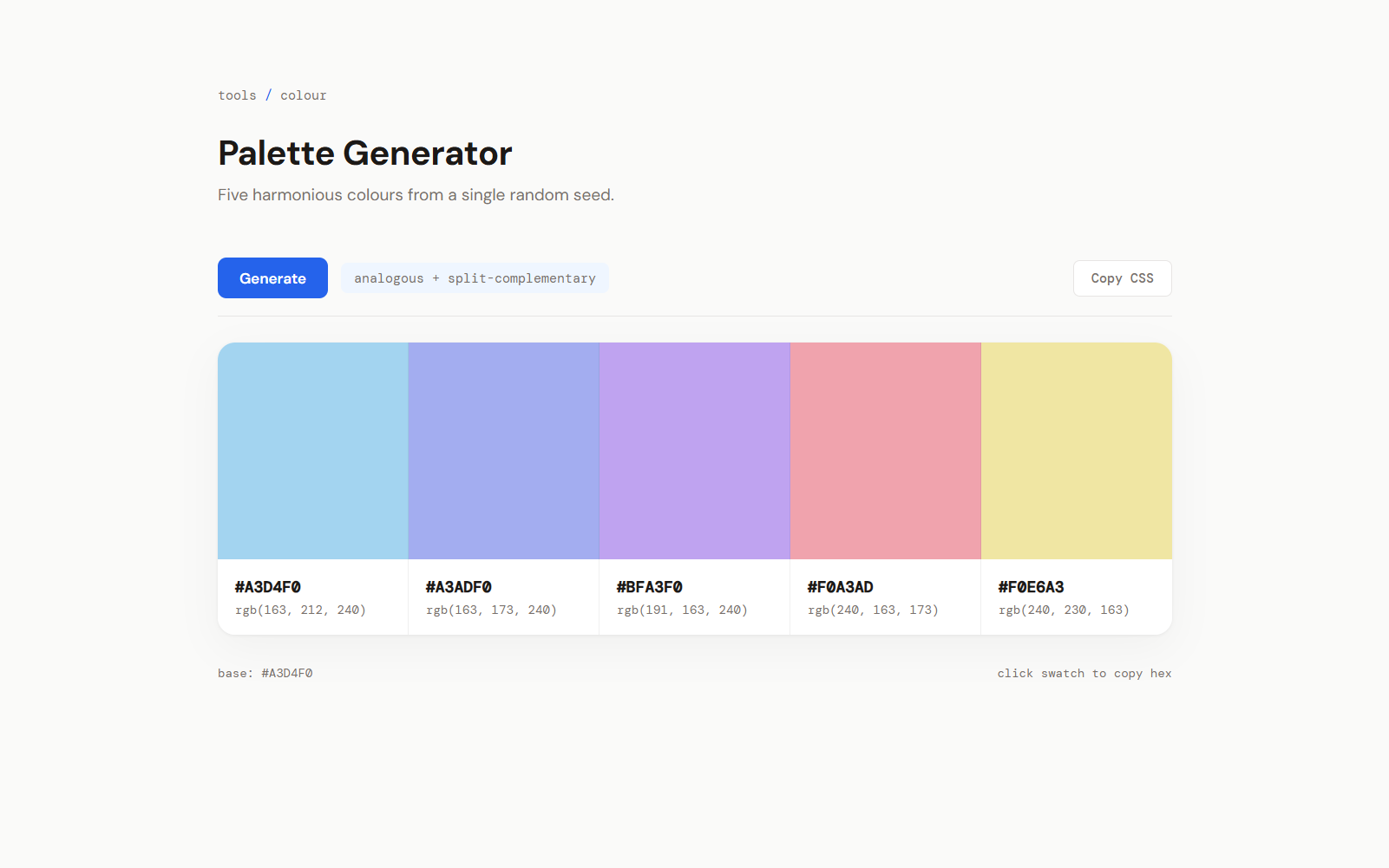
show base colour in a footer label, DM Sans + DM Mono fonts.Visually, this version is the favourite. Light background, no card gaps - the swatches sit flush in one unified block with only hairline borders between them. DM Sans and DM Mono are font choices I wouldn't have thought of myself, and they work. The "Copy CSS" button exports the palette as CSS custom properties, which turned out to be the single most useful feature across all four versions. It stopped looking like a demo and started looking like something I'd actually bookmark.
Claude caught things I'd gone blind to after a week of staring at the same palette generator. I'd stopped seeing the uniform card sizing and the centred-everything layout as problems - they'd become invisible. Having a second model point them out snapped me back to seeing the interface fresh. The "copy CSS variables" button was entirely Gemini's idea...
What it didn't do: Gemini has opinions but no hands. You get a list of suggestions and then you're back in Claude implementing them one by one. The round-trip is slower than either of the other approaches. Whether the extra friction is worth it depends on how stuck you are.
What Worked Best
After building all three variations and living with them for a bit, here's where I landed:
For quick one-off improvements, the manual prompt wins. If you have opinions about design (or can articulate a direction like "warm magazine editorial" or "clean developer tool"), paste your constraints directly. I've started pasting constraints into every new prototype request now.
For ongoing projects, just install the Skill. Once the Skill's in your project, Claude stops reaching for system fonts and flat gradients by default. You don't get pixel-perfect control, but you stop getting the same output twice.
If you're stuck use Gemini as a critic. When you've been staring at the same interface for hours, an external model's perspective cuts through the blindness you've built up. Gemini doesn't write code, but it spots convergence patterns you've gone blind to.
Worth noting: they layer on top of each other. I now keep the Skill installed permanently for baseline improvements, pull in Gemini when something feels off but I can't articulate why, and drop to manual prompts when I need pixel-level control.
I still can't design. I still don't know what a complementary triad is, and I'm fine with that. What I did learn is that the model already knows this stuff - it just needs sharper constraints to use it. My prototypes still write themselves. They just stopped looking identical.
Related Posts
Continue reading.
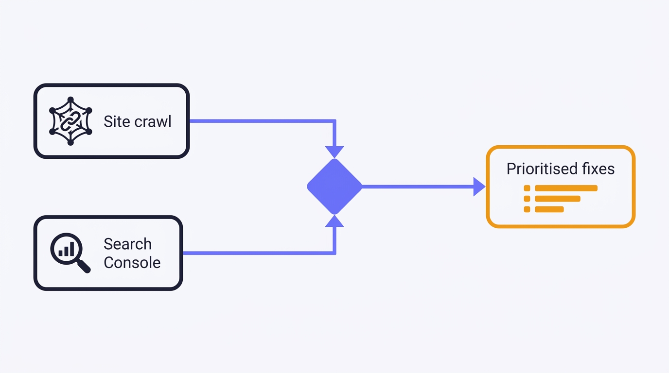
How to Do a Technical SEO Audit with Claude
A full technical SEO audit run by conversation in Claude Desktop: Search Console history and a first-party crawl merged into one prioritised, fix-writing report. The setup, the twelve prompts, the priority model, and the honest limits - walked through on a real site.
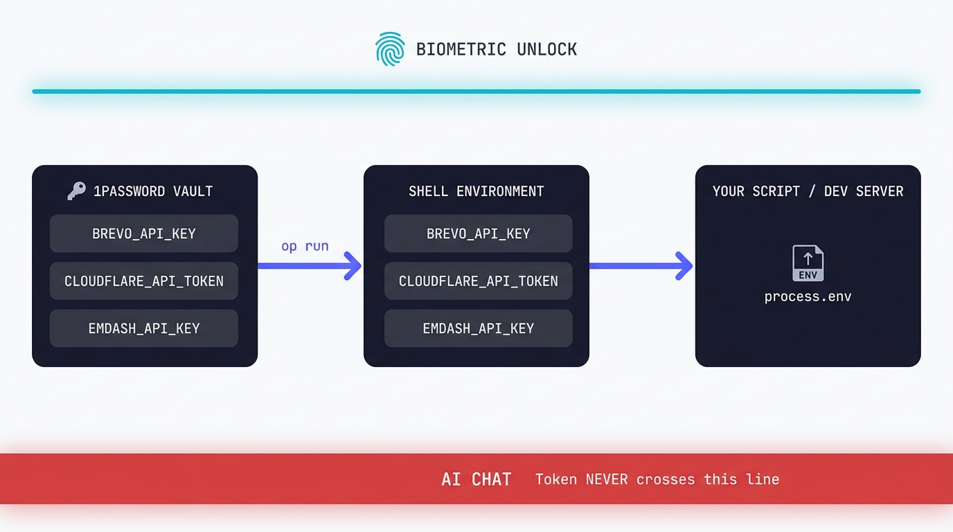
Claude Code API Key Security: A Guide to Token Hygiene
The simplest possible setup that keeps your production tokens out of AI chat windows. 1Password CLI, op run, and the conversational discipline that makes the rest of it work.
Swapping the Engine: How to Run Claude Code on Local Silicon for Zero Pennies
Claude Code's real power isn't the Anthropic model sitting behind it, it's the agentic : the file-system access, the tool use, the way it chains tasks together without you babysitting every step. I figured this out the expensive way. I ran…

A Beginner's Guide to Claude Computer Use
I've been letting Claude control my mouse and keyboard on and off to test this feature for a little while, and the honest answer is that it's simultaneously the most impressive and most frustrating AI feature I've used. It can navigate…
A Beginner's Guide to AI Mini PCs - Do You Need a DGX Spark?
I've been running a local LLM on a variety of bootstrapped bit of hardward, water-cooled 3090's and an LLM server I call hopper full of older Ada spec GPUs. When NVIDIA, Corsair, et al. all started shipping these tiny purpose-built AI…
Using a Local LLM to Audit Your Codebase - What Qwen3 Coder Next Catches (and Misses)
I ran a local copy of Qwen3 Coder Next on a machine under my desk. It pinned down a race condition in my production code that I'd missed. It also told me, with complete confidence, that crypto.randomUUID() doesn't work in Cloudflare…