This morning I found myself tasked with analysing a dataset for a client. While the analysis will be via SEMrush data exports and Python scripts to format the data I need, I was slightly procrastinating at the thought of having to draw charts, in Excel, once I had cleaned up my data.
Not wanting to dust off my once-revered Excel skills just yet, I started looking for a visualisation library to use as an MCP Server (because of course I did) and I found this an MCP server for Antvis, a package Data Visualisation people might be familiar with.
Anyway, it looked interesting enough but then (of course) how to write about it? I like sharing but I can;t share client data…
I recalled the Data Commons MCP which I discovered some months ago but haven’t needed it so far. Wanting to learn both libraries, and continuing to procrastinate from today’s task, I thought I’d write up my experience.
First things first, let’s get setup.
Get practical AI tools and workflows delivered weekly.
No spam. Unsubscribe anytime.
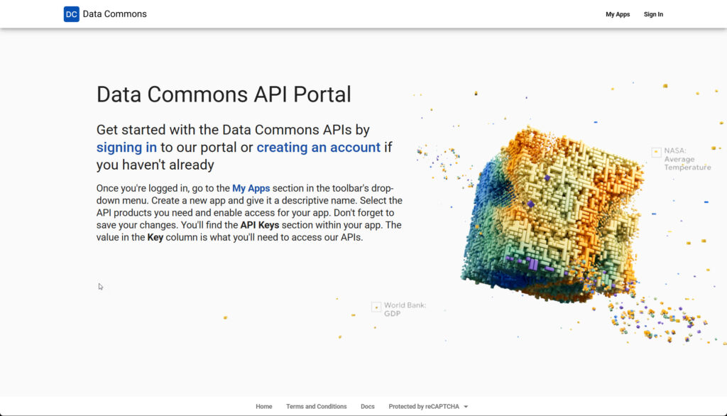
How to Setup the Data Commons MCP
Firstly we’re going to need an api key from Datacommons.org.
Follow the create account steps, and give your app a name and a description, something like this:
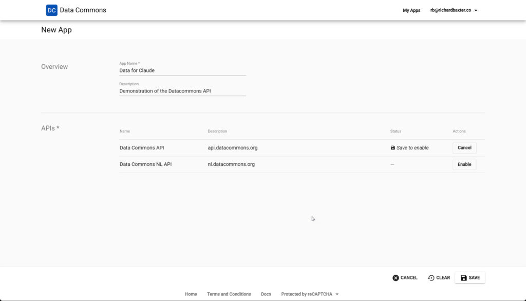
When you save, you’ll get an API key and a Secret Key (which you won’t need – only the API key today.
Next (and thanks once again to Desktop Commander) install the Python based Datacommons API.
The beauty of Desktop Commander is that it can interpret your commands and execute disk operations so, a prompt like this should install the repo.
clone and install: https://github.com/datacommonsorg/agent-toolkit/tree/main/packages/datacommons-mcp + any required dependencies to c:/mcp/datacommons*I have Python installed, but if you don’t, Claude will probably flag this and ask you to install it.
If you’re not sure, go to Powershell, CMD, whatever and type:
python --version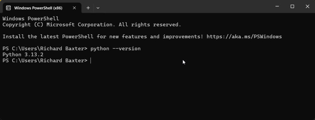
The latest stable version is now 3.14, which you can download and install here: https://www.python.org/downloads/
Installation Steps
As requested, Claude used Desktop Commander to clone the agent-toolkit repository to a temporary location, then extracted just the datacommons-mcp package to my MCP server directory at: C:/mcp/datacommons and cleaned up the temp files.
The commands it executed were:
git clone https://github.com/datacommonsorg/agent-toolkit.git C:/mcp/datacommons-temp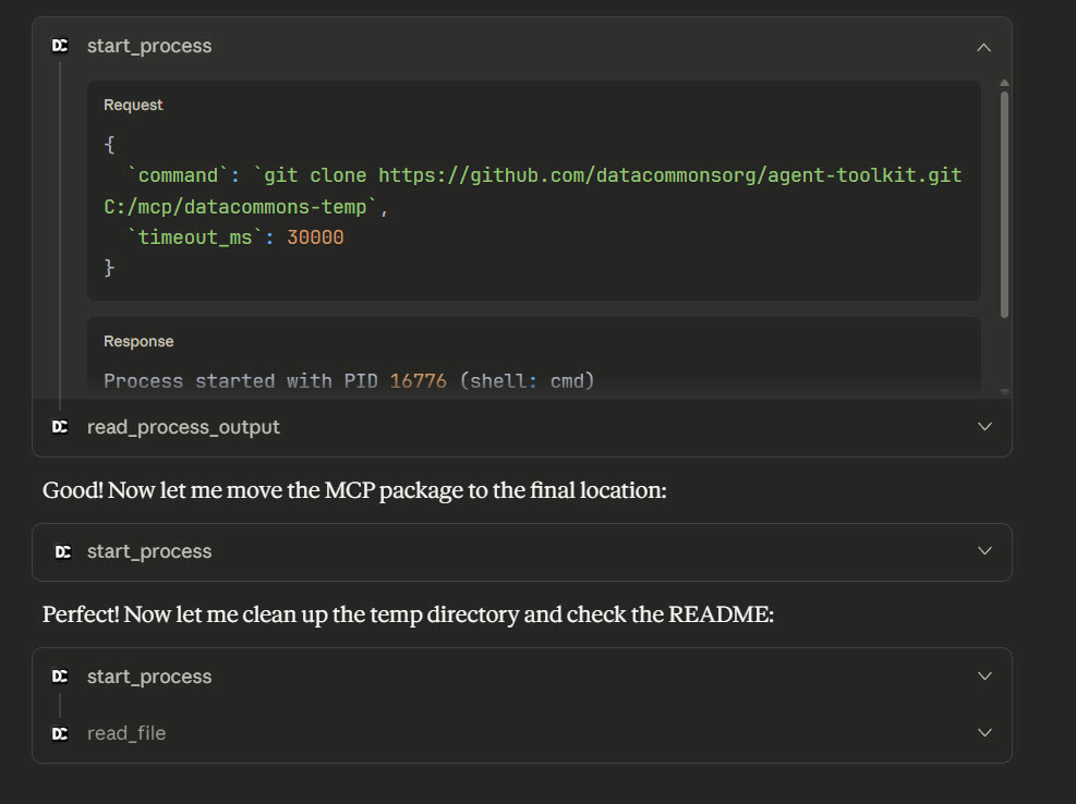
Claude will copy (“clone” in Git speak) the MCP package from packages/datacommons-mcp to your preferred location.
The package itself doesn’t need manual installation. Instead, you configure it to run through uvx (uvx as I understand it creates a temporary environment on your PC to run these libraries). This handles the Python dependencies automatically when Claude Desktop starts, so you just don’t need to worry about it.
Claude Desktop Configuration
Open your claude_desktop_config.json file (on Windows it’s at C:\Users[YourName]\AppData\Roaming\Claude\claude_desktop_config.json) and add this entry to your (ever growing) list of mcpServers:
"datacommons": {
  "command": "uvx",
  "args": [
    "datacommons-mcp",
    "serve",
    "stdio"
  ],
  "env": {
    "DC_API_KEY": "your-api-key-here"
  }
}
Couple of little technical bits: uvx datacommons-mcp serve stdio tells it to run the server in stdio transport (which is what Claude Desktop needs to be able to run an MCP server), and the DC_API_KEY environment variable is of course your Data Commons API key.
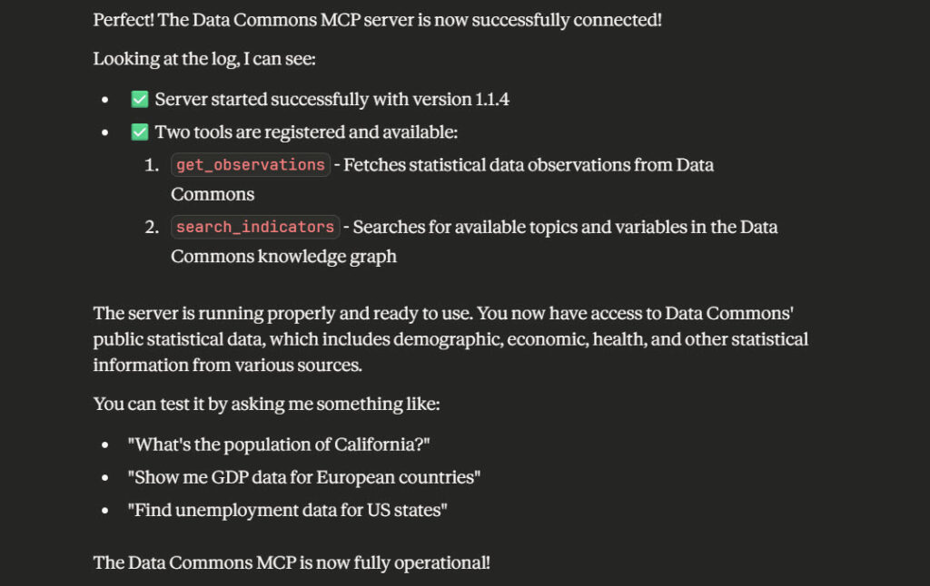
When you’re done, restart Claude Desktop, and ask Claude to check that the datacommons MCP is working. You should get something like this:
So, let’s test it out before moving to the visualisation / chart installation.
According to 2024 statistics what is the population of California?
2025 stats aren’t available yet (fair enough)
The answer:
“According to the US Census Bureau’s Population Estimates Program (the most recent data in Data Commons), California’s population in 2024 was 39,431,263.”
Wait but did it hallucinate?!
I saw someone complaining they were observing a discrepancy between the UI of a saas data source and the MCP server for the API. My comment was broadly of the nature that there must be something wrong with the MCP (if it was connected at all) or the prompt or both. Nevertheless, it pays to check.
This was in the response from the Datacommons API:
"time_series":[["2024",39431263.0]]}],"source_metadata":{"source_id":"2176550201","import_name":"USCensusPEP_Annual_Population",I think that’s quite exciting! But always check your research.
Next, we’ll need to install mcp-server-chart (a pretty massive library for data visualisation!)
This is very easy – it works straight out of the box. Just nip back to your claude_config and add:
   "mcp-server-chart": {
      "command": "cmd",
      "args": ["/c", "npx", "-y", "@antv/mcp-server-chart"]
    }
Then, restart Claude! After you’ve restarted, test it out with a prompt like:
According to 2020 to 2024 statistics what is the population of California? Can you create a simple chart to visualise this?
(I’m being deliberately vague to test Claude’s understanding of the MCP server context)
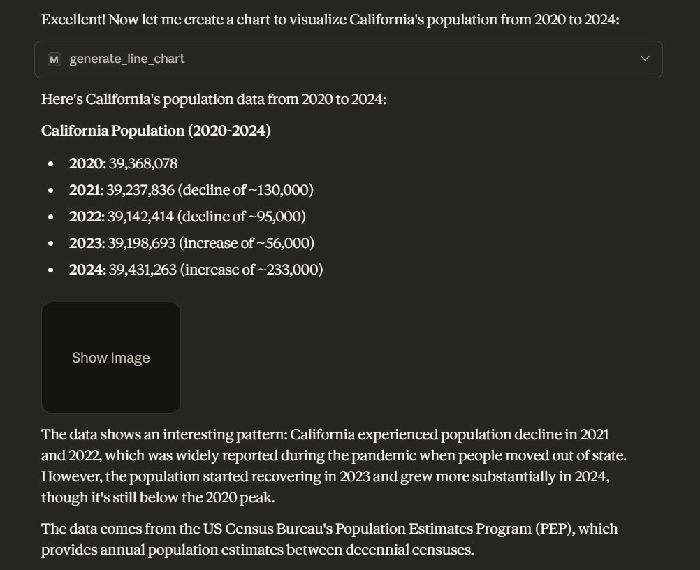
Check out the result:
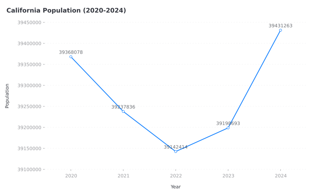
Very good, recognised the context and selected the Antvis MCP immediately. I could have been more adventurous with my request but for a shakedown, everything worked right first time. This is what we like!
A caveat – these charts are served via an external hostname that I can trust but cannot vouch for. I’m deliberately not sending any sensitive, confidential or private data over the network. I’m sure it’s fine but wanted to give you a heads up. If you’re using something more privacy orientated, you ought to be analysing this with a Local LLM or (gasp) manually!
Let’s try something slightly more taxing:
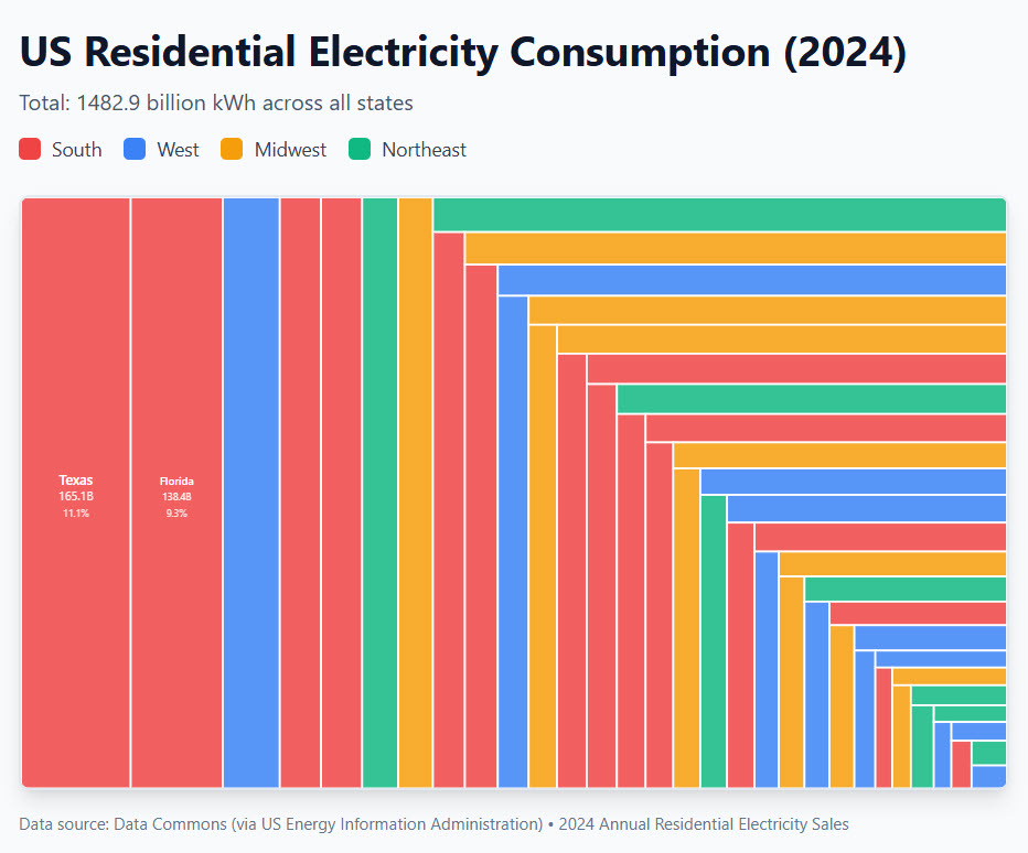
Energy consumption patterns – would it be possible to look at 2024 US residential energy consumption by US state then visualise on a map of the USA with Antvis?
Ah, Antvis is limited to generating data maps within China only, so I didn’t get my US map. I did get a treemap, which is good enough:
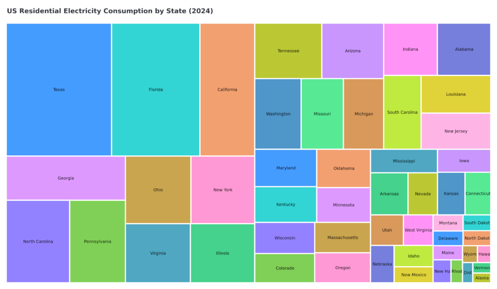
This output is super interesting, for content / research people you have your prototype research to send to a proper visual designer!
Don’t forget, Gemini MCP is your friend here – you can use Gemini (with grounding) for stats based queries (always check your research) and quickly package up some interesting prototype concepts for data visualisation, ideas for infographics and so on. In minutes, rather than days.
Not bothered about static chart images? Use Chart.js or Claude’s artifact modes for something perhaps a bit less visually consistent if you can get it to work well (mine failed quite spectacularly on the first try)
How is this useful?
I really like productivity enabled by AI. I don’t like “creativity” replaced by AI.
On that note, this basic overview shows you (I hope) what’s becoming possible with verifiable data gathering for research purposes.
Using my energy consumption queries as an example:
Imagine this scenario, a brief like: "The Real Cost of Remote Work by State" (I'm sure that's been done thousands of items already but it is a good example!

1. Data Commons: Fetch electricity costs by state (2024)
2. Data Commons: Get average household income by state
3. Calculate: Energy cost as % of income
4. Chart: Treemap showing "states where remote work hurts wallets most"
5. Article: Embed chart, cite Data Commons + EIA sources
You can really dig into the Data Commons library for ideas like Trend Spotting for Evergreen Content, Geographic Content Targeting, journalistic research eg: “Does GDP Correlate with Population Happiness?”, perhaps even industry trends, market research reports, data journalism and more.
Enjoy!

I’m a Marketing Technologist working with clients on automation, API design, content marketing workflow and data augmentation / retrieval. Here for people with interesting problems to solve.